Designer Basics: Landscape Layouts
Source: Houzz
Let your landscape reflect your style.
In the same way that a person’s sartorial style is expressed through their clothing choices, landscapes reflect our personalities in some recognizable ways. When we look at clothes we see that the cut can be tailored or loose, boxy or drapey, or some type of combination. Some people like strong geometrics, long flowy layers or contrasting shapes and textures in their outfits.
Landscape design is similar. There are some basic styles or archetypes that are the foundation of design. The plantings will and do vary extensively, but the principles remain the same.
Three basic landscape layout are Symmetrical, Diagonal and Curves. These three are not the only options, but they serve as a great starting point. With so many great examples of each style, it is impossible for a single post to do them justice. I’ll introduce them here, and we’ll delve in a little deeper in future posts.
1. Symmetrical
Source: Houzz
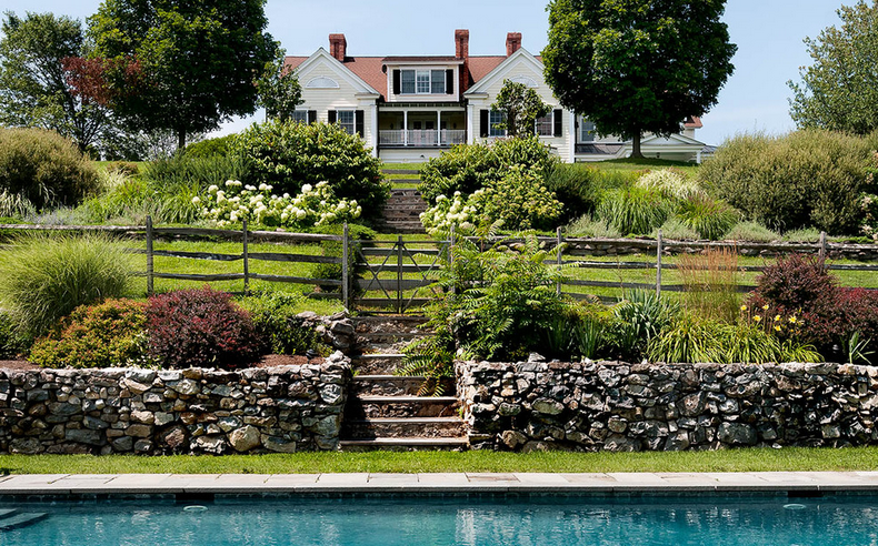
The symmetrical garden is an orderly garden that can range from casual to formal. In it we find logical beginnings and ends, and everything in its place. The symmetrical garden is a more traditional look that compliments a variety of architectural styles. In the photo below we see symmetry on a larger scale and in multiple layers. Two large trees frame the house in the centre, grounding it as a focal point. Steps down from the top lawn take the visitor through a split bed of large shrubs, hydrangea and grassy perennials towards the pool. Although the beds are not identical, they are equal in terms of visual weight and balance.
The lower bed in the stone retaining wall echoes some of the textures of the first bed with the inclusion of day lily and some other grasses. The lower bed is smaller than the upper bed, but the visual weight of the stone wall compliments balances both the lawn and larger bed above it.
There are a couple of other elements to notice here. First, there is symmetry in the split rail fence and the retaining wall. Secondly, the fence and wall run perpendicular to the steps, creating an axis. Thirdly, placing the house (focal point) on the axis is classic, symmetrical design.
Often people hear the words ‘symmetrical’ and ‘formal’ and think stuffy, and that doesn’t have to be the case. Because the symmetrical designs follow particular rules, some people can find the designs predictable, but these clear expectation offer a certain comfort. One can relax when paths are clearly identified and the spaces are defined. This picture is a perfect example of formal design with a casual, inviting feel.
2. DIAGONAL
Source: Houzz
The diagonal garden is a great option for landscapes that otherwise might resemble a bowling alley. Often the lines are rectilinear (straight lines and 90 degree angles) on an axis that has been rotated. This shifts the energy, and opens up the space, making it feel larger.
New proportions are created by this shift. Instead of looking from front to back along a straight axis, our eyes are forced left and right, across the yard, back and forth. This is a big part of what makes the space feel bigger. It is surprising and happily off kilter.
In the photo above, the wooden boardwalk creates the main line of the axis. The wooden deck from where it originates, is split into sections at complimentary angles to itself and the boardwalk. The flagstone patio at the rear of the yard is nestled in to the greenery. As a result of shifting the axis, the proportions of the back beds are larger than they would be if the design wasn’t on the diagonal. This gives opportunity for denser planting and that allows for small trees to be included without encroaching on the patio.
3. CURVES
Source: Houzz
Curves in the landscape are a natural design technique. Often we think of curved garden beds, beautiful lawns and a more traditional approach to design. Designers even speak of voluptuous curves that bring to mind hourglass shapes that translate well to the landscape.
In this photo above, curves are used in a small space in a modern application. The patio curves around the water feature but incorporates the fire bowl in this ying yang- esque design. The curved bench brings the curves up into the space where they will be physically experienced as the marshmallows are roasted. The globe-like shape of the palm tree by the fence echoes the curves in a transition from circle to sphere.
Curves bring a softness to the landscape and an easy grace reminiscent of a meandering stream. In a small space, curves can have a modern, clean look as they create interest and define the space. In a larger landscape, the curves are more sweeping, often disappearing behind trees and shrubs, inviting the visitor to keep exploring.
Over to you - do you like stately symmetry or a quirky diagonal or dramatic curves? What are your inspirations?


